
From Raw Reports to a Scalable SaaS Platform
Avnet Digital Supply Chain
ProscalNext is an internal enterprise platform developed by Avnet during the pandemic to help clients monitor and respond to supply chain disruptions. Initially built from a fragmented set of Power BI dashboards, the platform struggled to perform and scale as more customers joined.
As the sole and founding designer, I was tasked with leading the transformation of ProscalNext into a customizable, proactive, and scalable SaaS platform, shaping a product that could support both customer growth and evolving business goals.
Role
Sole UX Designer
Keyword
SaaS, Enterprise, Cross-functional, Prototyping, User Testing, Branding

Impact
During my time on the Proscal project, our redesigned platform experience led to a 250% increase in average session duration and a 200% rise in average pages per session—clear signals of deeper user engagement. The platform now serves over 20 enterprise customers across EMEA and APAC, potentially generating up to 3% more revenue per contract. These outcomes reflect a shift from passive data extraction to active in-platform analysis, positioning Proscal as a strategic tool in day-to-day supply chain decision-making.
250%↑
Average session duration
200%↑
Average pages per session
20+
Global enterprise customers
3%↑
Potential revenue per contract
The Problem
ProscalNext (Proscal) was meant to consolidate thousands of scattered Excel files into actionable dashboards. However, after two years of building customizable visualizations and charts, the team faced a fundamental challenge:
Customers were using our well-curated dashboard
as nothing more than an Excel downloading tool.
63% of users stayed for less than 15 min per session, and most users visited only 30% of the dashboard pages we built for them. It became a major threat to the platform’s success, making it difficult to justify evolving Proscal into a revenue-generating service to drive business impact.
Fixing The Foundation
Bring clarity & customization to existing offerings
When I first joined, the team relied on Power BI to create on-demand analytics dashboards. This approach was both labor-intensive and inefficient, requiring the team to build each dashboard from scratch for every new customer or request. To build a scalable foundation, I led a complete redesign of the platform’s baseline dashboard template, balancing clarity, flexibility, and storytelling.
Roadblock
There are only so many dashboards,
but users always need more than what’s available
Despite improved design and consistency, we quickly hit a roadblock: users still need to build more custom dashboards for each analytical need. It became clear that no matter how polished our dashboards were, a static reporting model couldn't keep up with dynamic, time-sensitive questions. As a result, users defaulted to downloading raw data into Excel and creating analytics that static dashboards couldn't offer.
Reframing Engagement
After the design revamp, a product review session became a wake-up call. Average session time remained flat, and the volume of custom dashboard requests hadn’t decreased.
There was a deeper engagement gap we had yet to close. This led to deeper thinking about what else we could offer beyond a static dashboard.
How can we shift from reactive reporting to proactive intelligence?
Back to the Root Cause
Users need both raw reports and data visualizations
By analyzing usage data and interviewing 3 key users, we learned that users weren’t abandoning dashboards due to poor design, but because dashboards alone weren’t enough.
Users rely on both raw data and visual summaries to work effectively: dashboards help them spot high-level trends, while raw reports support granular analysis. Instead of having users jump between platforms, we needed to build a flexible ecosystem that supports both in-depth data exploration and high-level decision-making.
Back to the Root Cause
Users defaulted to Excel for simple, personalized analytical work
We also discovered that most of our audience, falls between the ages of 35 and 55, are deeply accustomed to using Excel for data analysis and visualization.
Even though our dashboards were built around customer requirements, they often fell short of meeting individual analysts’ needs. We also found that most customers only created simple charts and tables in Excel. They didn’t need complex or advanced visualizations, just fast and flexible tools that fit their own thinking process.
Internal Operations
We need a native solution to ensure data security and consistency
Our focus expanded to the internal operations that support our customers. They mentioned a challenge when users create their own analysis, teams need to spent excessive time reconciling numbers before major reporting cycles to ensure alignment, which led to inefficiencies and conflicting insights. They also emphasized the need to solve this challenge natively within our platform Proscal to ensure data security standards.
In a word
We needed native features that empowers users to explore data independently
while ensuring security, consistency, and collaboration.
After learning more about our users and internal operations, I translated them into actionable design requirements and led a series of brainstorming workshops and feasibility discussions that ultimately shaped the direction of our final product.
Solution 1
Reporting: A centralized, flexible place to
download, edit, and schedule raw data reports
Despite improving the dashboards' design and consistency, we quickly hit a roadblock: users still relied on us to manually create new dashboard pages for every specific analytical request. It became clear that no matter how polished our dashboards were, a static reporting model couldn't keep up with dynamic, evolving business questions.
Solution 2
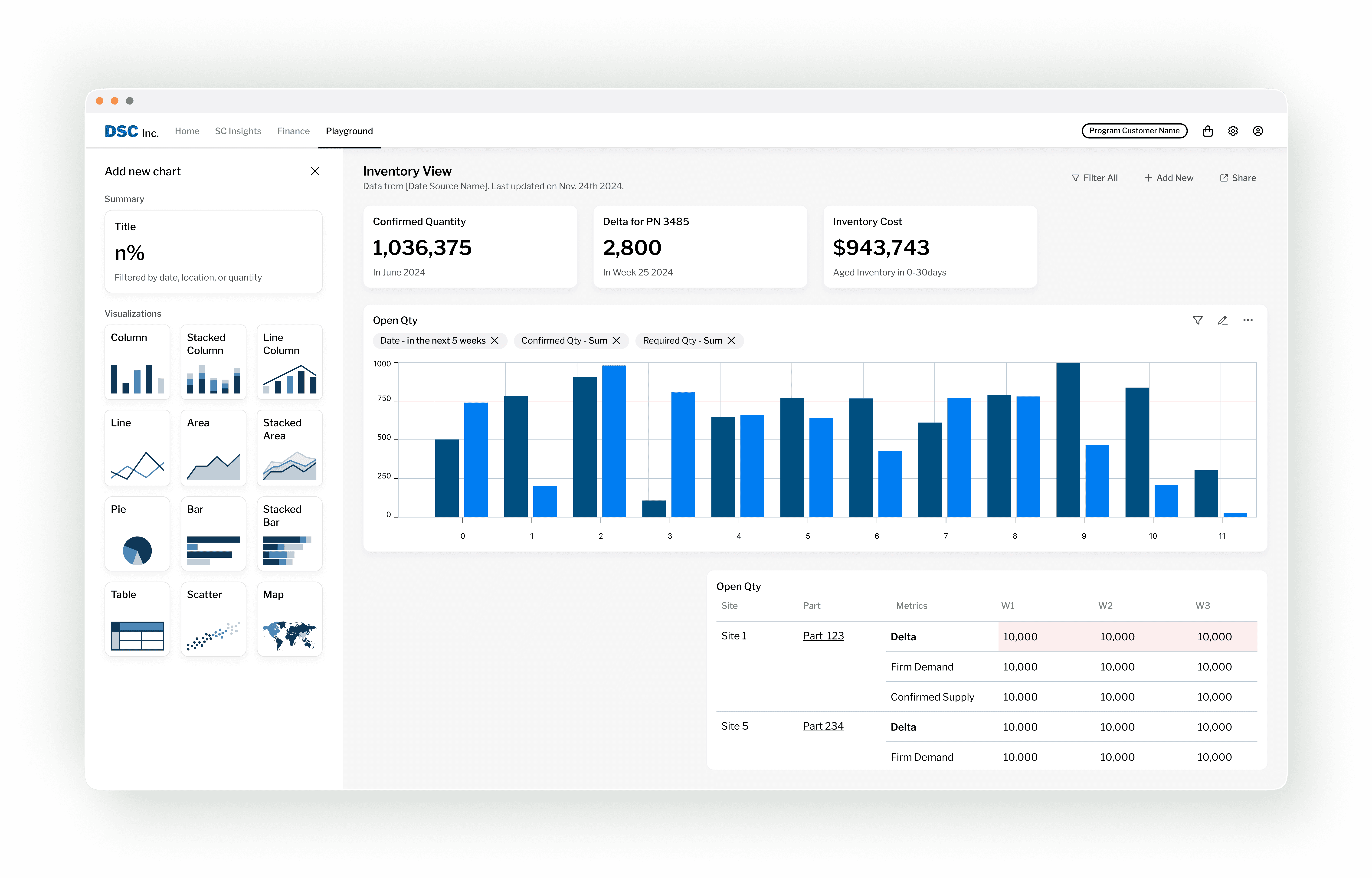
Playground: A dynamic space to
build, customize, and share data visualizations
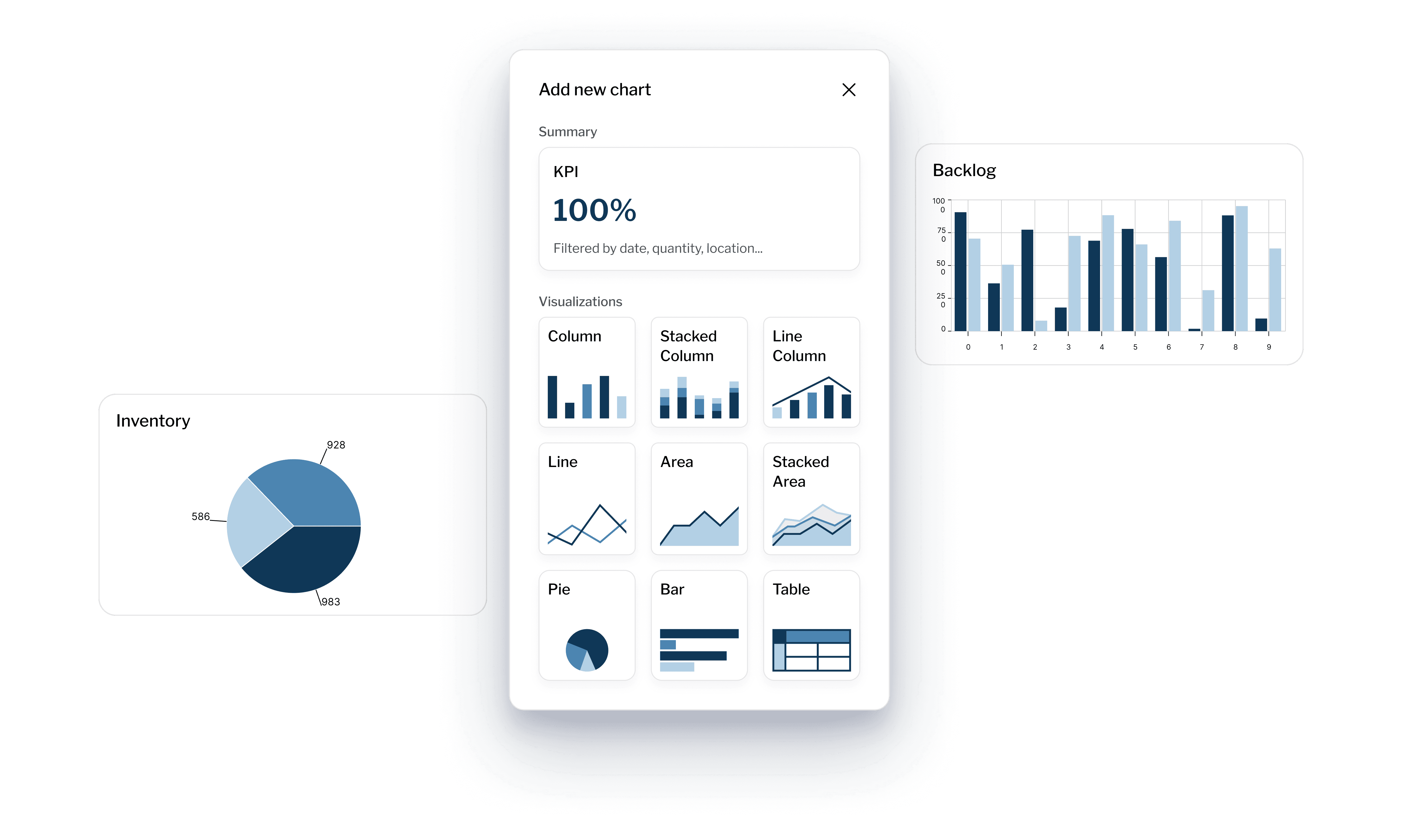
Easy Chart Creation
Inspired by familiar Excel workflows, we designed a left-side tool panel that guides users through building visualizations step by step. Users can start by selecting the type of chart, and then customize it with relevant data.
Responsive Grid
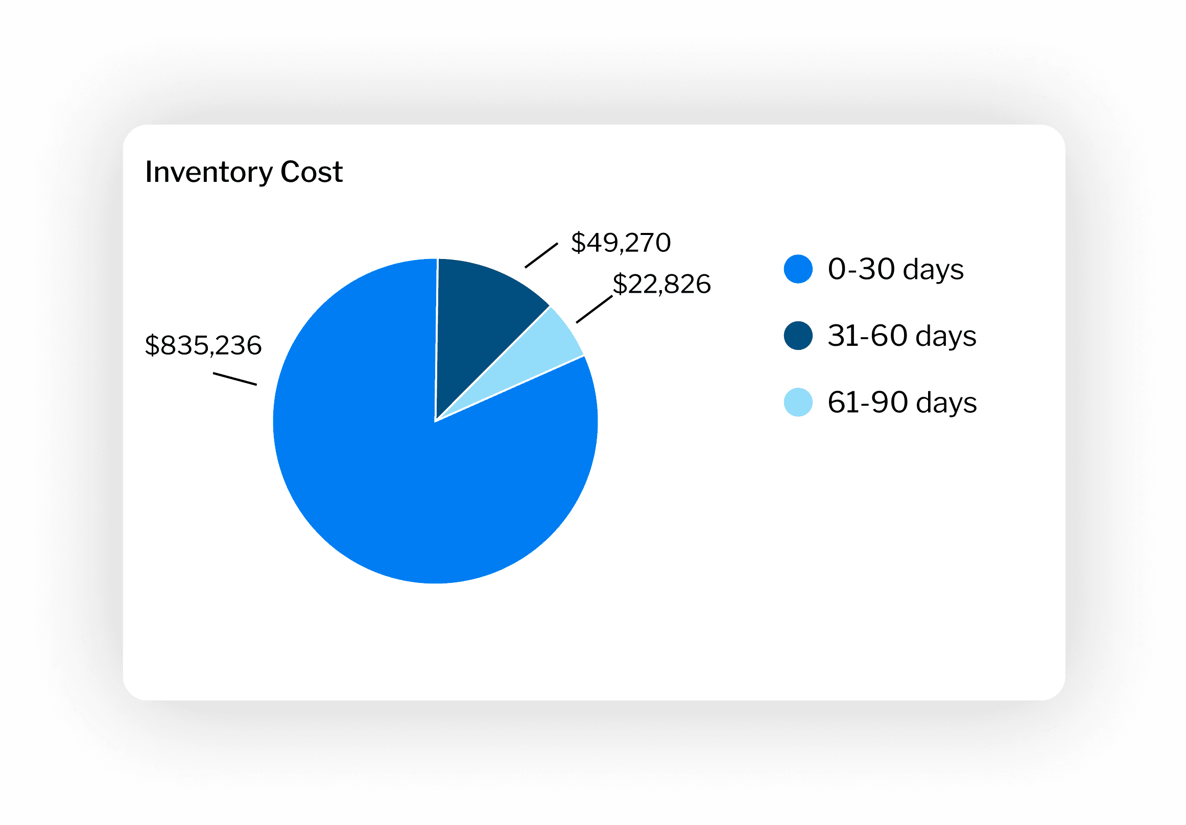
To balance user flexibility with development feasibility, we introduced a default responsive grid system. Each row can fit up to 4 KPI cards, 2 visualization components, and 1 data table.
Title
text
Previous
Up Next
Designed by Hailey Yixuan Li